| Special
Flag. The overiding consideration for the stamp was
how to represent the Nations of Oceania with a single stamp. With so many Nations
and a sensitive history- for instance the Spanish slave trade, seemed a way to
bring discord. It was then decided to feature an all embracing flag, yet no flag
exists for all the Nations of Oceania. It was thus decided to design such a flag
around the theme of the Southern Cross which is a constellation of the Pacific
Nations. A peace wreath embraces the stars on Pacific blue. The only other color
apart from blue and white is the gold lined stars representing the sun which shows
on many individual countries flags. But it was also decided to print the stamp
in a single color of pacific blue so that the flag would appear dark blue on a
light - almost sky blue background. The stamp was to be small and have the date
as part of the design with the words Oceania Nations postage and a value in New
Zealand dollars of 81 cents.
Back
Catalogue Index pages 1-6
 | The
first step was the designing of the flag. This Grey pencil sketch was produced
for the flag and developed into a blue artist essay sketch. |
 | The
peace wreath and the stars were added and this was developed into this mono color
blue version. |
 | Then
this color version was created with gold on the inside of the stars. By this time
it was decided the stamp would be printed in tones of blue, and so the blue monocolor
version of the flag was chosen above. |
| |
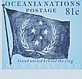 | | The
first essay version to be printed was this 81cent plain background. This was printed
in pairs in a tone of blue. These had the words New Zealand in white along the
bottom and the phrase - stand united behind the flag, The stars and the wreath
appear faintly blue and the flag background very dark. |
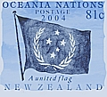 | | Essay
two had the cloud background and the border was ragged. New Zealand appeared solid.
This was printed in pairs with a modification to the words- stand united behind
the flag , to A united flag. |
|

| | At
this stage it was decided to balance the colors and to lighten the flag. For the
first time a scenic background was used instead, so this was from a new grey toned
plate and some grey tone images were printed for contrast balance. |
|
 
| |
The blue printings without words or values were printed until
the desired tone of blue was achieved below. These color trials were done in strips
until the desired tone and contrast was achieved. These color balancing printings
were printed on ungummed paper five across from dark to the lightest. |
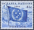 | Proofs
were printed in blocks of four. The words- A united flag, was deleted as it was
decided the stamp would be too political. The value was still 81 cents. |
 |
For the proof printing of sheets of twenty and the imperforate
specimen overprints the value was changed to 85 cents. Production
printing of sheets departed from previous by printing onto prior perforated sheets
and the stamps printed into each perforation frame |
Wine Post © |

